


When digital conversations happen in seconds, plain text often can’t convey the warmth or irony of a facial expression.
To bridge this gap, Google’s design team has recently introduced the new Noto 3D emoji for its products and for the Android systems.
The company decided to share the behind-the-scenes of this transition from flat graphics to three dimensions, revealing fascinating details about how these small icons are modeled, including some playful anatomical discoveries that emerge when you observe a face from every angle.
Google reveals its new Noto 3D emojis
The shift to three-dimensional modeling has forced the company to answer unusual questions. If a flat image has only one point of view, a 3D model requires designing an entire body at 360 degrees.
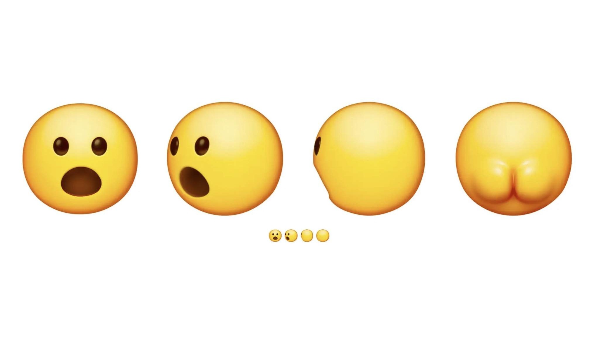
While exploring this concept, the designers playfully showed what lies behind the classic shocked smiley face, imagining a real “lato B” for the visible emoji by turning the camera.
Beyond the irony, the need to view figures from every angle allowed to correct old mistakes. For example, the classic two-dimensional poodle hid a paw, effectively becoming a tripod; today, thanks to volume, it has regained its natural four-legged stance.
Moreover, the research conducted by the team has shown that full figures generate greater empathy than floating heads alone, pushing the designers to create complete bodies for animals that were previously cut out, such as the raccoon.
Expression vs Realism
Having access to advanced graphic tools doesn’t mean you have to use them to create hyperrealistic models. The team applied what they define as the “kangaroo rule“: a marsupial drawn with extreme anatomical precision would be threatening, similar to a bodybuilder ready for a fight, completely altering the tone of a friendly message.
The priority has always been to preserve the emotional intent. Adding excessive details, such as irises or the depth of the nostrils, slows the human brain’s ability to process the emotion.
To pass the strict test of readability at only 18 pixels on smartphone screens, each icon was simplified to the maximum.
An iron rule dictated that every emoji maintain no more than 3 essential visual details, ensuring a clear and immediate interpretation, as in the case of the volcano reduced solely to the shape of the mountain and the lava.
Legibility and Human Touch
One of the most challenging tasks was ensuring the visibility of emojis in dark mode, especially for darker skin tones that risked disappearing on black or gray backgrounds.
No user should have to sacrifice their identity to keep their messages readable. To address the issue across all the 3977 available characters, Google used a contrast analysis tool to scan the edges of the images.
However, instead of applying automatic filters that would have faded the original colors to pass the test, the artists intervened manually. The designers painted slight highlights and lighting on the contours to make the silhouettes stand out in any lighting condition.
The entire Noto 3D library has finally been made open source and published on Github, leaving the creative community the freedom to download, use, and modify this colorful graphic vocabulary.